CharTTool 3.9

CharTTool Chart Gallery

Twenty-four real CharTTool screenshots: every one of the 32 technical indicators, most of the 26 drawing tools, all seven color schemes and intervals from 1 minute to 1 week. Under each chart is a short technical analysis explaining what each indicator measures and what it shows on that chart. Click any chart to see it full size.

Download free trial Buy now – $39.95 Product page User guide

Technical indicators and drawing tools

All charts in this section use the Light color scheme, daily candles and a one-year range, so the only thing that changes from chart to chart is the indicator set and the drawings.

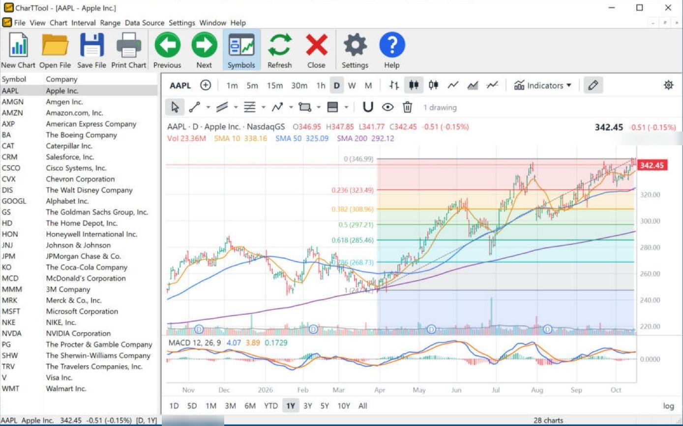
CharTTool daily chart of Apple with 10, 50 and 200-day simple moving averages, a MACD pane and a Fibonacci retracement drawn from the April low to the October high
Click to enlarge

Apple (AAPL): MACD and Fibonacci retracement

Daily candles · 1 year · SMA 10/50/200, Volume, MACD · drawing: Fib Retracement

  • Simple moving averages 10, 50 and 200 – the average close of the last 10, 50 and 200 days. Here they are stacked in bullish order (10 above 50 above 200) and all rising, the classic picture of an established uptrend.
  • MACD (12, 26, 9) – the difference between a 12-day and a 26-day EMA, with a 9-day signal line and a histogram of the gap between them. MACD (4.07) is above zero and just above its signal line (3.89), but the histogram is small: the trend is up while its momentum is flattening.
  • Fibonacci retracement – horizontal levels at 23.6%, 38.2%, 50%, 61.8% and 78.6% of a move, where pullbacks often pause. Drawn on the April-to-October advance, it puts the first supports at 323.49 (0.236) and 308.96 (0.382); the August pullback found support in the 0.382–0.5 zone.

Reading the chart: a healthy uptrend near its high (342.45 against the 346.99 top). A pullback toward the 0.236 level and the rising 50-day average would be the first test of the trend.
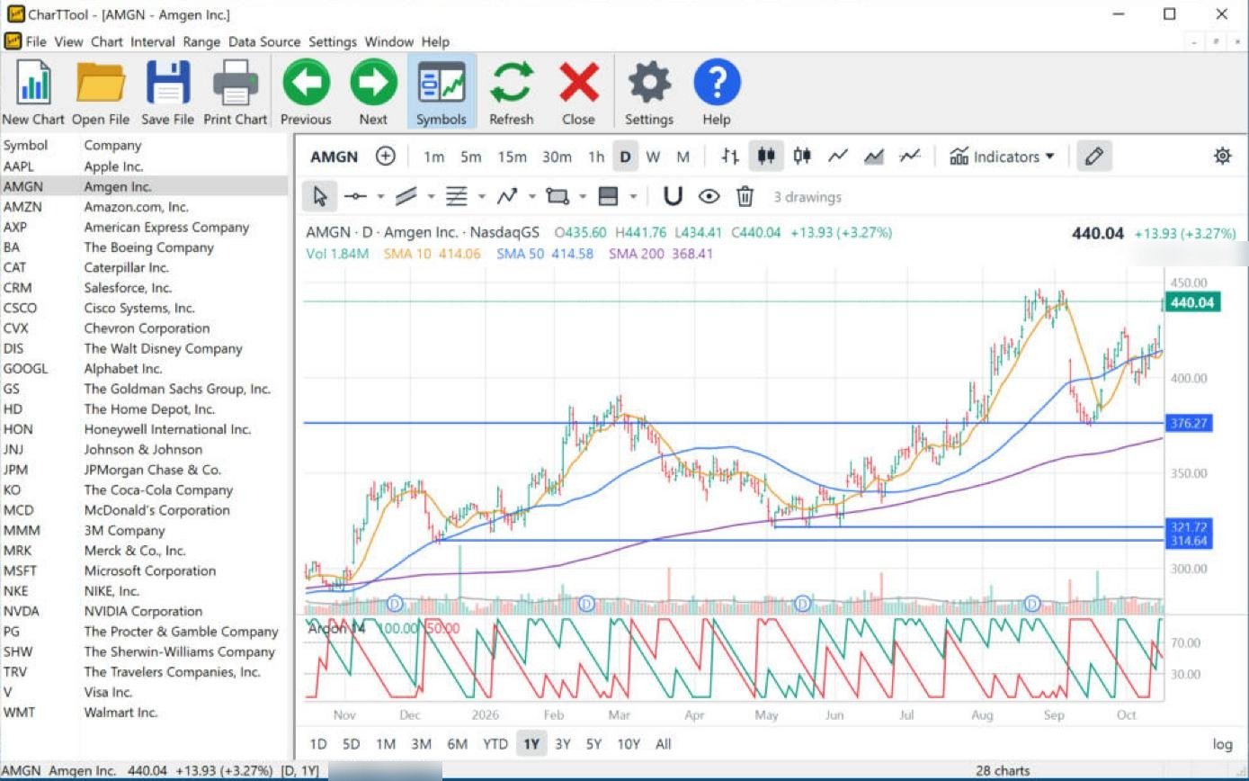
CharTTool daily chart of Amgen with moving averages, an Aroon pane and three horizontal support lines at 376.27, 321.72 and 314.64
Click to enlarge

Amgen (AMGN): Aroon and support levels

Daily candles · 1 year · SMA 10/50/200, Volume, Aroon · drawings: horizontal lines and ray

  • Aroon (14) – Aroon Up and Aroon Down measure how many bars have passed since the 14-day high and low, scaled 0–100. Aroon Up at 100 means a new 14-day high was set on the last bar, and Aroon Up above Aroon Down confirms the uptrend.
  • Horizontal lines and ray – price levels with a tag on the axis. The line at 376.27 marks the February–March highs; that old resistance turned into support when the September pullback stopped right on it. The lower lines at 321.72 and 314.64 mark the May and December lows.
  • Moving averages – price (440.04) is above all three averages and the 200-day SMA (368.41) rises steadily.

Reading the chart: a textbook “resistance becomes support” retest at 376, followed by a fresh 14-day high – the uptrend resumed.

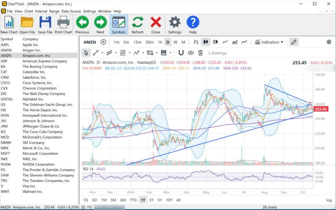
CharTTool daily chart of Amazon with Bollinger Bands, moving averages, an RSI pane and two converging trend lines forming a triangle
Click to enlarge

Amazon (AMZN): Bollinger Bands, RSI and a triangle

Daily candles · 1 year · Bollinger Bands, SMA 10/50/200, RSI · drawings: two trend lines

  • Bollinger Bands (20, 2) – a 20-day SMA with bands two standard deviations above and below. The bands have narrowed sharply since August (262.54 / 253.35 / 244.15): a “squeeze” that shows low volatility and often comes before a large move.
  • RSI (14) – compares average gains with average losses on a 0–100 scale; above 70 is overbought, below 30 oversold. At 48.65 it is neutral and gives no direction on its own.
  • Trend lines – a rising line under the March and August lows and a falling line from the August high form a symmetrical triangle. Price (253.45) is now near its apex.

Reading the chart: tight bands inside a converging triangle – the market is coiling. A close outside the triangle, ideally with the bands expanding, would show the direction of the next move.

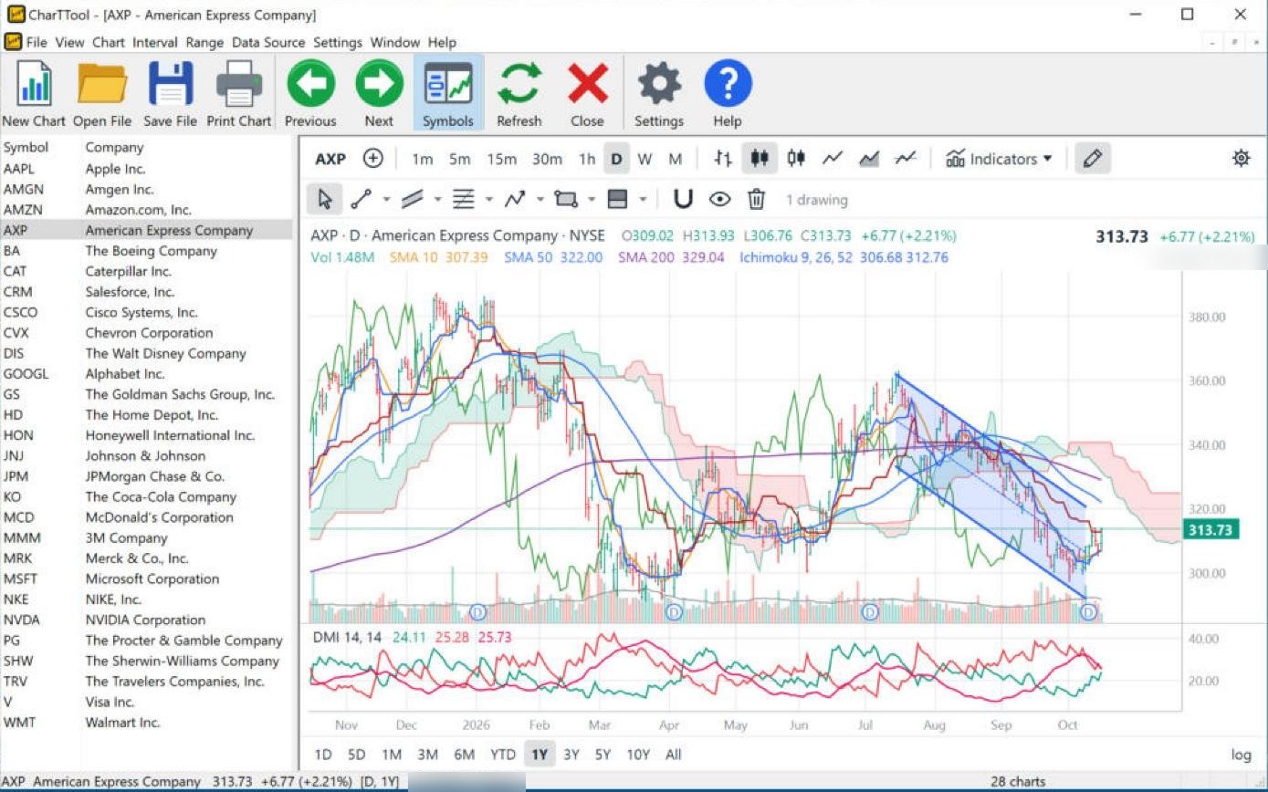
CharTTool daily chart of American Express with the Ichimoku Cloud, moving averages, an ADX/DMI pane and a descending parallel channel
Click to enlarge

American Express (AXP): Ichimoku Cloud, ADX/DMI and a channel

Daily candles · 1 year · Ichimoku 9/26/52, SMA 10/50/200, ADX / DMI · drawing: Parallel Channel

  • Ichimoku Cloud (9, 26, 52) – the conversion line (9), base line (26), lagging span and a cloud plotted 26 bars ahead. Price (313.73) is below the cloud, and the cloud ahead is red (bearish), so overhead resistance sits around 320–340.
  • ADX / DMI (14, 14) – +DI and −DI show whether buyers or sellers control the range; ADX shows how strong the trend is. +DI and −DI have converged and +DI is turning up: the selling pressure of the summer is fading.
  • Parallel channel – drawn from the July high, it contains the whole decline. The last bars bounced off its lower line.
  • Moving averages – price is below the 50-day (322.00) and 200-day (329.04) SMAs.

Reading the chart: still a downtrend inside the channel and under the cloud, with early signs of a rebound. A break above the upper channel line and the cloud would be needed to change the picture.

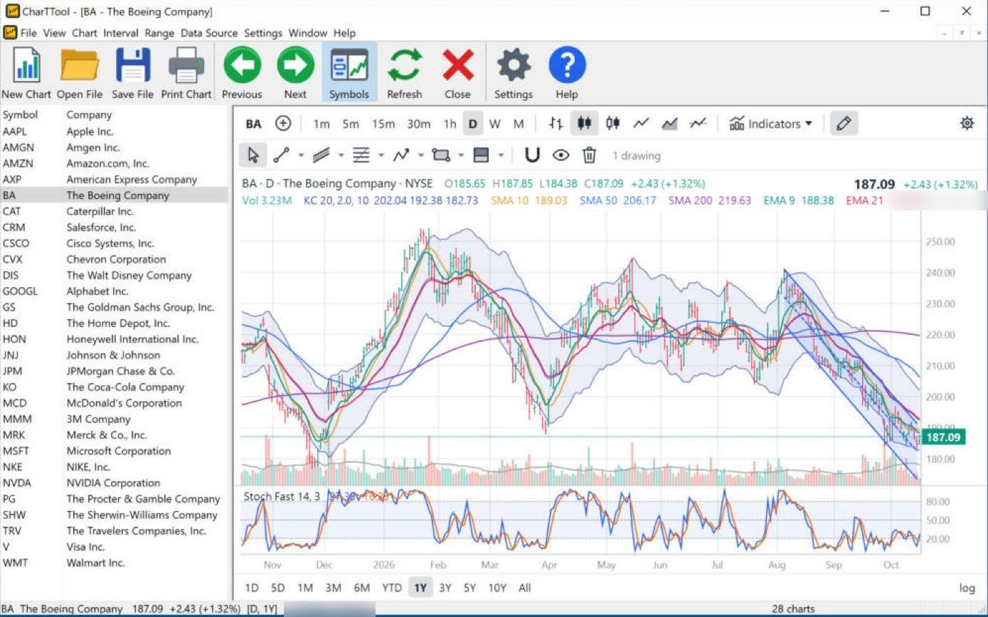
CharTTool daily chart of Boeing with Keltner Channels, simple and exponential moving averages, a Fast Stochastic pane and a linear regression channel
Click to enlarge

Boeing (BA): Keltner Channels, EMAs, Fast Stochastic and a regression channel

Daily candles · 1 year · Keltner Channels, SMA 10/50/200, EMA 9 and 21, Fast Stochastic · drawing: Regression Channel

  • Keltner Channels (20, 2, ATR 10) – a 20-day EMA with bands two ATRs away. Price (187.09) is in the lower half of the channel (202.04 / 192.38 / 182.73), where it has been since August.
  • EMA 9 and EMA 21 – exponential averages react faster than simple ones. The 9-day EMA (188.38) below the 21-day EMA is a short-term bearish crossover.
  • Fast Stochastic (14, 3) – where the close sits within the 14-day high-low range, 0–100. It has stayed below 20 (oversold) for most of October.
  • Linear regression channel – a least-squares line through the closes since the August high, with parallel bands. Its steep slope measures the strength of the decline.

Reading the chart: a strong downtrend, below all averages, near the lower regression and Keltner lines. Oversold stochastics can produce a bounce, but in a downtrend they can stay oversold for weeks.

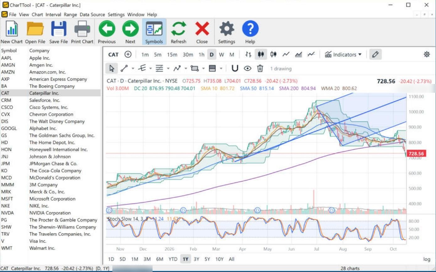
CharTTool daily chart of Caterpillar with Donchian Channels, simple and weighted moving averages, a Slow Stochastic pane and Andrews' Pitchfork
Click to enlarge

Caterpillar (CAT): Donchian Channels, WMA, Slow Stochastic and Andrews' Pitchfork

Daily candles · 1 year · Donchian Channels, SMA 10/50/200, WMA 20, Slow Stochastic · drawing: Andrews' Pitchfork

  • Donchian Channels (20) – the highest high and lowest low of the last 20 days. The last close (728.56, −2.73%) is below the lower line, a new 20-day low: the trend-following breakout signal turned bearish.
  • WMA 20 – a weighted average that gives more weight to recent closes; at 800.62 it now sits far above price.
  • Slow Stochastic (14, 3, 3) – a smoothed stochastic with fewer false signals. At about 11 it is deeply oversold.
  • Andrews' Pitchfork – a median line from a pivot through the midpoint of the next two swings, with parallel lines through the swings. Price followed the fork through the spring rally and has now broken below its lower line and below the 200-day SMA (804.94).

Reading the chart: a sharp breakdown from a long uptrend. Losing the pitchfork, the Donchian low and the 200-day average together marks a change of trend, even if oversold stochastics allow a short-term bounce.

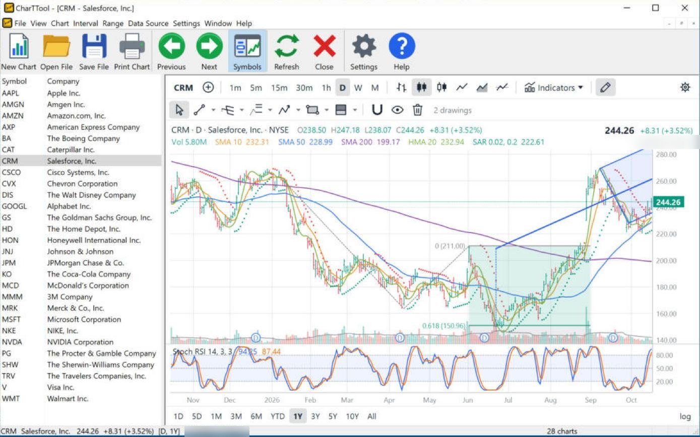
CharTTool daily chart of Salesforce with Parabolic SAR dots, Hull moving average, a Stochastic RSI pane, a Schiff pitchfork and a trend-based Fibonacci extension
Click to enlarge

Salesforce (CRM): Parabolic SAR, Hull MA, Stochastic RSI, Schiff Pitchfork and Fib extension

Daily candles · 1 year · Parabolic SAR, Hull MA 20, SMA 10/50/200, Stochastic RSI · drawings: Schiff Pitchfork, Fib Extension

  • Parabolic SAR (0.02, 0.2) – dots that trail the price and flip sides when the trend reverses. The dots are below price (222.61 vs 244.26), so the SAR is in “long” mode.
  • Hull MA 20 – a fast, low-lag average built from weighted averages; it turns earlier than an SMA of the same length and is turning up again.
  • Stochastic RSI (14, 3, 3) – the stochastic formula applied to RSI, very sensitive. At 94 / 87 it is overbought, typical of a strong short-term push.
  • Trend-based Fibonacci extension – projects targets from three points. Its 0.618 projection at 150.96 came within a few dollars of the late-June low.
  • Schiff Pitchfork – a pitchfork that starts halfway to the first swing, better suited to steep moves; it frames the September–October pullback.

Reading the chart: after the gap above the 200-day SMA (199.17) in September the trend turned up; SAR and Hull MA agree, while Stochastic RSI warns that the short-term move is stretched.

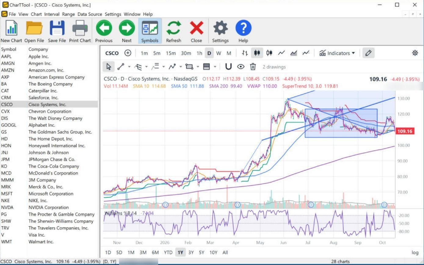
CharTTool daily chart of Cisco with the SuperTrend line, VWAP, a Williams %R pane, a shaded rectangle around a trading range and a Modified Schiff pitchfork
Click to enlarge

Cisco (CSCO): SuperTrend, VWAP, Williams %R, rectangle and Modified Schiff Pitchfork

Daily candles · 1 year · SuperTrend, VWAP, SMA 10/50/200, Williams %R · drawings: Rectangle, Modified Schiff Pitchfork

  • SuperTrend (10, 3) – a line three ATRs from the median price that sits below price in an uptrend (green) and above it in a downtrend (red). It is red at 119.81, above the price (109.16).
  • VWAP – the volume-weighted average price. It restarts every day, so on a daily chart it shows only the day's average (110.00); it is most useful on intraday charts.
  • Williams %R (14) – the close relative to the 14-day range on a 0 to −100 scale; below −80 is oversold. At −74.94 it is approaching that zone.
  • Rectangle – shades the July–September trading range; price (−3.95% on the day) has fallen back into its lower half.
  • Modified Schiff Pitchfork – drawn from the spring breakout; price has dropped below its median line.

Reading the chart: the long-term trend is up (price well above the rising 200-day SMA at 99.40), but the short-term trend has turned down within the range. The rectangle's lower edge near 105 is the support to watch.

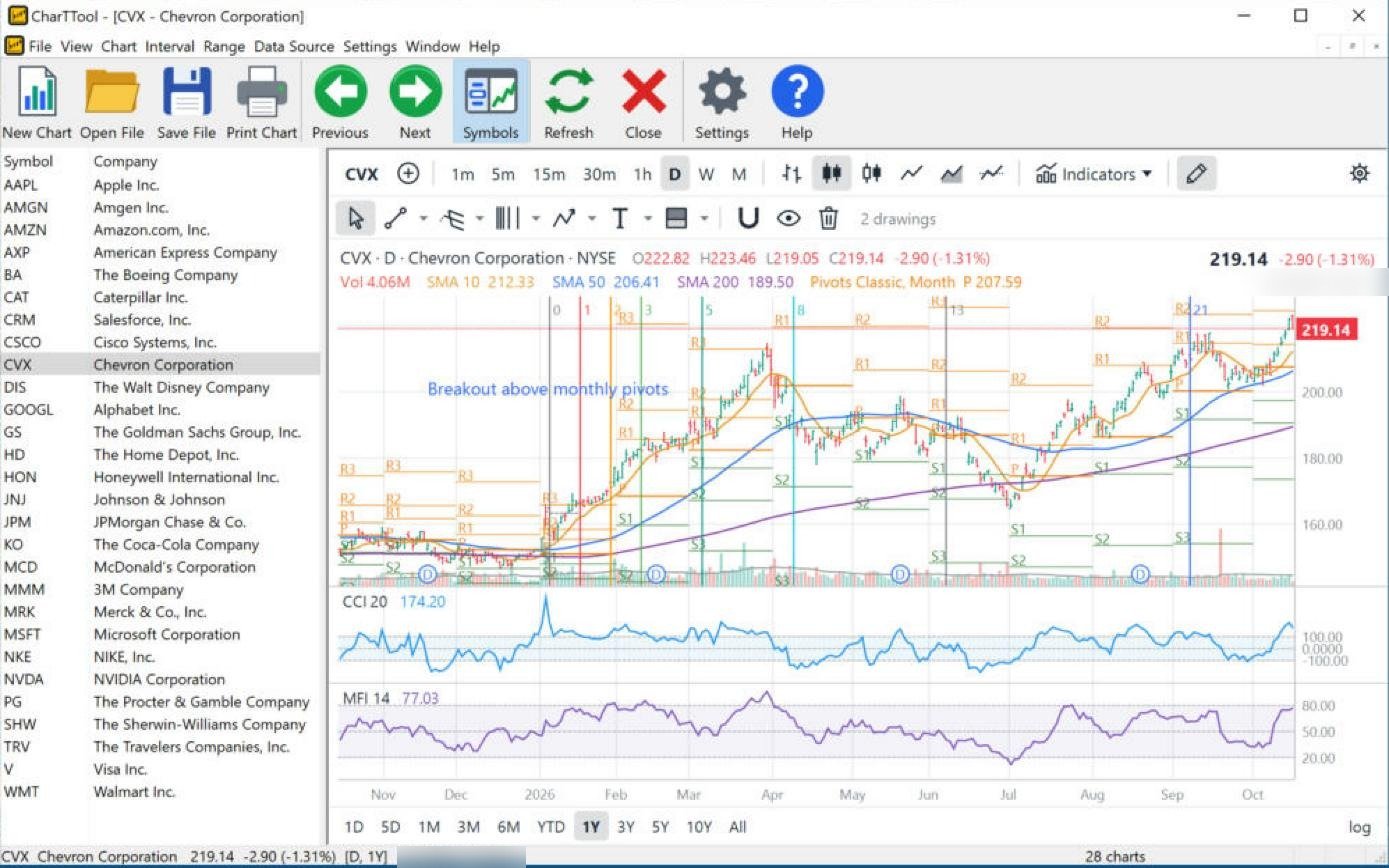
CharTTool daily chart of Chevron with monthly classic pivot points, CCI and Money Flow Index panes, Fibonacci time zones and a text note
Click to enlarge

Chevron (CVX): monthly Pivot Points, CCI, MFI and Fibonacci time zones

Daily candles · 1 year · Pivot Points (Classic, monthly), SMA 10/50/200, CCI, MFI · drawings: Fib Time Zones, Text

  • Pivot Points (Classic, monthly) – a pivot (P) and resistance and support levels (R1–R3, S1–S3) calculated from the previous month's high, low and close. Price (219.14) is above the current month's R2 – a strong month.
  • CCI (20) – how far the typical price is from its average, in units of mean deviation. Above +100 (here 174.20) signals a strong trend move.
  • Money Flow Index (14) – a volume-weighted RSI. At 77 it is close to the 80 overbought line: buying volume is strong.
  • Fibonacci time zones – vertical lines at 0, 1, 2, 3, 5, 8, 13, 21 units from a starting bar, marking times when turning points are more likely.
  • Text note – “Breakout above monthly pivots”, the January move that started the uptrend.

Reading the chart: an uptrend with expanding momentum (CCI and MFI high, price above R2). Momentum this high is often followed by consolidation back toward R1.

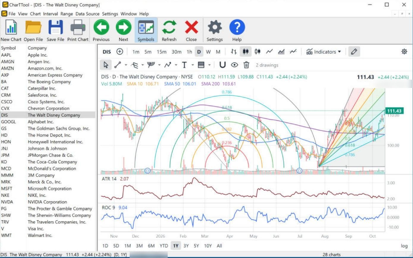
CharTTool daily chart of Disney with ATR and Rate of Change panes, Fibonacci arcs over the spring decline and a Fibonacci fan from the July low
Click to enlarge

Disney (DIS): ATR, Rate of Change, Fibonacci fan and arcs

Daily candles · 1 year · SMA 10/50/200, ATR, ROC · drawings: Fib Fan, Fib Arcs

  • ATR (14) – average true range, the typical daily price swing. It fell from about 3.3 in February to 2.07: volatility is contracting.
  • Rate of Change (9) – the percent change over 9 days. At +9.04% momentum is strongly positive.
  • Fibonacci arcs – half circles at 0.236–0.786 of a move, combining price and time; drawn on the January–April decline, they mark curved resistance zones for the rebound.
  • Fibonacci fan – lines from the July low at Fibonacci fractions of the rally. The September–October pullback held on the lower fan lines before the latest rise.

Reading the chart: price (111.43) is back above the 50-day and 200-day averages (106.01 and 103.61) with strong rate of change and calm volatility – a constructive setup.

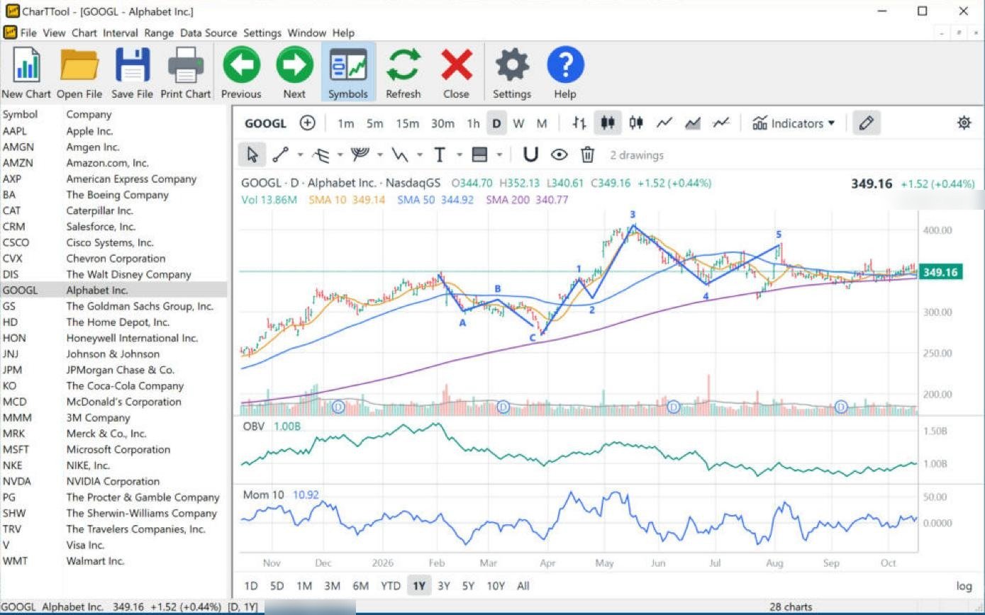
CharTTool daily chart of Alphabet with On Balance Volume and Momentum panes, an Elliott ABC correction and a five-wave impulse
Click to enlarge

Alphabet (GOOGL): Momentum, OBV and Elliott waves

Daily candles · 1 year · SMA 10/50/200, OBV, Momentum · drawings: Corrective Wave (ABC), Impulse Wave (1-5)

  • Elliott waves – an A-B-C correction from February to April, followed by a five-wave advance (1–5) into August. Wave 5 ended below wave 3, a “truncated fifth” that often signals an exhausted trend.
  • On Balance Volume – adds volume on up days and subtracts it on down days. OBV peaked in February near 1.5B and is now about 1.0B, so it did not confirm the summer highs.
  • Momentum (10) – the close minus the close 10 days ago. At +10.92 it is mildly positive.

Reading the chart: since the fifth wave price has moved sideways (349.16) on top of the flattening 50-day and 200-day averages. Weak OBV argues for caution until price breaks out of the range.

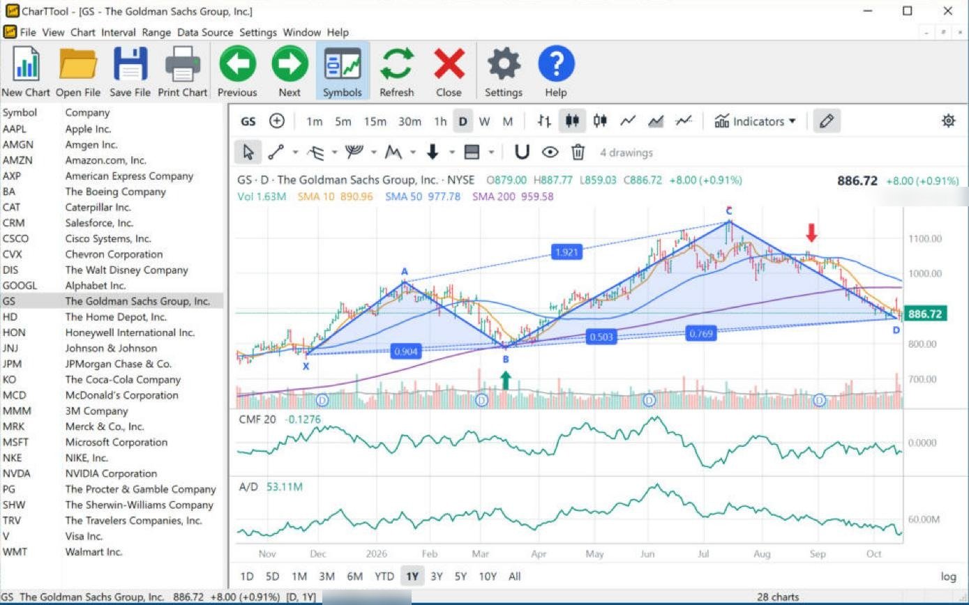
CharTTool daily chart of Goldman Sachs with Chaikin Money Flow and Accumulation/Distribution panes, a harmonic XABCD pattern with Fibonacci ratios, and buy and sell arrows
Click to enlarge

Goldman Sachs (GS): Chaikin Money Flow, A/D line and an XABCD pattern

Daily candles · 1 year · SMA 10/50/200, Chaikin Money Flow, Accumulation/Distribution · drawings: XABCD Pattern, buy and sell arrows

  • Chaikin Money Flow (20) – volume-weighted buying vs. selling pressure over 20 days, positive or negative around zero. At −0.13 sellers are in control.
  • Accumulation/Distribution – a running total of volume weighted by where each close falls in its range. It has declined since June: distribution.
  • XABCD harmonic pattern – five pivots with the Fibonacci ratio of each leg (0.904, 1.921, 0.503, 0.769) shown on the chart; the D point marks a potential reversal zone. Price has just reached D.
  • Buy and sell arrows – notes on the chart; here they mark the B low in March and the failed rally in early September.

Reading the chart: price (886.72) is at the pattern's D point, below the 50-day and 200-day averages, with negative money flow. A reversal at D would need money flow to turn positive.

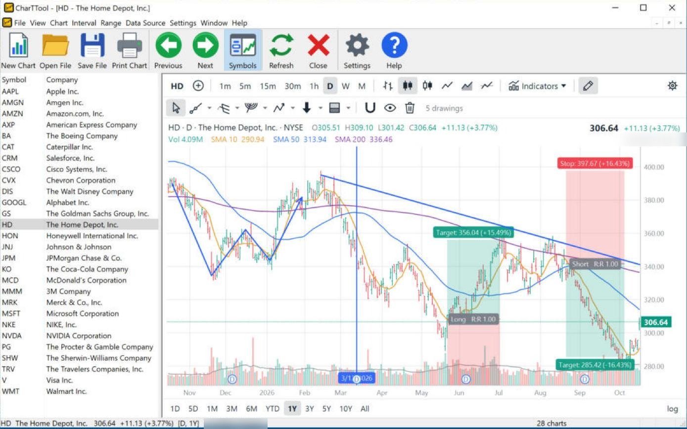
CharTTool daily chart of Home Depot with a long position and a short position showing target, stop and reward/risk, a descending ray, a vertical line and a path
Click to enlarge

Home Depot (HD): long and short positions, ray, vertical line and path

Daily candles · 1 year · SMA 10/50/200 · drawings: Long Position, Short Position, Ray, Vertical Line, Path

  • Long and short positions – plan a trade from entry, target and stop; CharTTool shows the percent move and reward/risk ratio. The long from late May targets 356.04 (+15.49%), reached in July; the short from late August targets 285.42 (−16.43%) with a stop at 397.67, reached in October.
  • Ray – a trend line extended to the right. Drawn from the February high, it capped the rallies in July and August.
  • Vertical line – marks a date (here mid-March, the start of the spring decline). Path – a free polyline tracing the swings from November to February.

Reading the chart: the stock remains in a downtrend under the falling ray and below the 50-day (313.94) and 200-day (336.46) averages, despite the +3.77% day.

Color schemes and chart styles

CharTTool has seven color schemes and six chart styles. The Symbols list on the left can be hidden to give the chart the whole window.

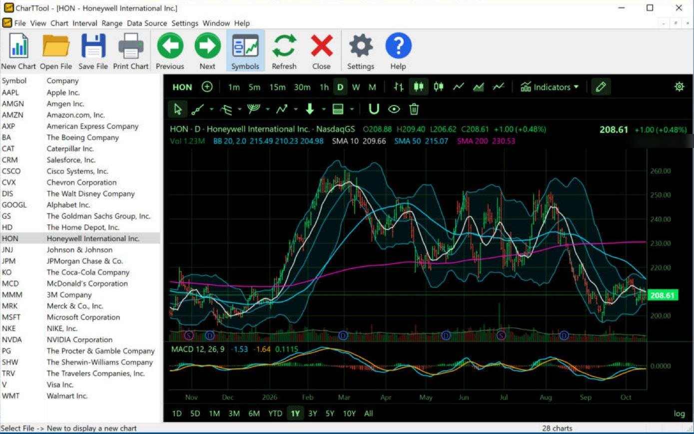
CharTTool chart of Honeywell in the black Terminal color scheme with Bollinger Bands, moving averages, dividend and split markers and a MACD pane
Click to enlarge

Honeywell (HON): Terminal scheme, Bollinger Bands and MACD

Terminal scheme · daily candles · 1 year · Bollinger Bands, SMA 10/50/200, MACD

  • Bollinger Bands (20, 2) – price (208.61) sits between the middle (210.23) and lower (204.98) band after the September sell-off.
  • MACD (12, 26, 9) – below zero (−1.53) but just above its signal line (−1.64): bearish momentum is easing.
  • D and S markers – dividends and splits/distributions are marked on the volume bars.

Reading the chart: below the 200-day SMA (230.53), so the larger trend is down; the MACD crossover is the first sign of stabilization.

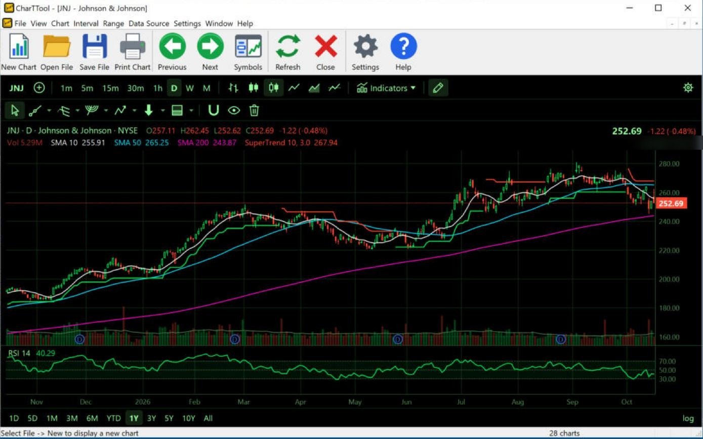
CharTTool chart of Johnson and Johnson in the Terminal scheme with hollow candles, the SuperTrend line and an RSI pane, with the Symbols list hidden
Click to enlarge

Johnson & Johnson (JNJ): hollow candles, SuperTrend and RSI

Terminal scheme · Hollow Candles · daily · 1 year · Symbols list hidden · SuperTrend, SMA 10/50/200, RSI

  • Hollow candles – the body is empty when the close is above the open; the color shows whether the close is above or below the previous close.
  • SuperTrend (10, 3) – after following the uptrend all year, it flipped to red above price (267.94) in October.
  • RSI (14) – 40.29, weak but not oversold.

Reading the chart: the first SuperTrend sell signal in months, while price (252.69) is still above the rising 200-day SMA (243.87) – a correction inside a long-term uptrend so far.

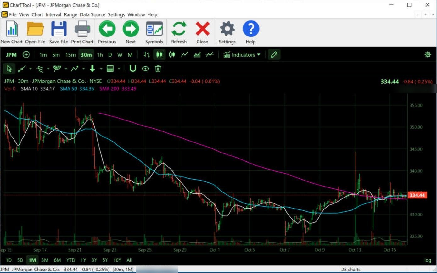
CharTTool 30-minute chart of JPMorgan Chase over one month in the Terminal scheme, with 10, 50 and 200-bar moving averages
Click to enlarge

JPMorgan Chase (JPM): 30-minute chart

Terminal scheme · 30-minute candles · 1 month · Symbols list hidden · SMA 10/50/200

  • Moving averages on intraday bars – on a 30-minute chart the periods are bars, not days: the 200-bar SMA covers about 15 trading days.
  • The 200-bar SMA fell from late September and has now flattened at 333.49; the 10-bar and 50-bar averages have risen to meet it.

Reading the chart: after the early-October low near 326, price (334.44) recovered to the converging averages. Averages bunched together like this mean a balanced market that is waiting for direction.

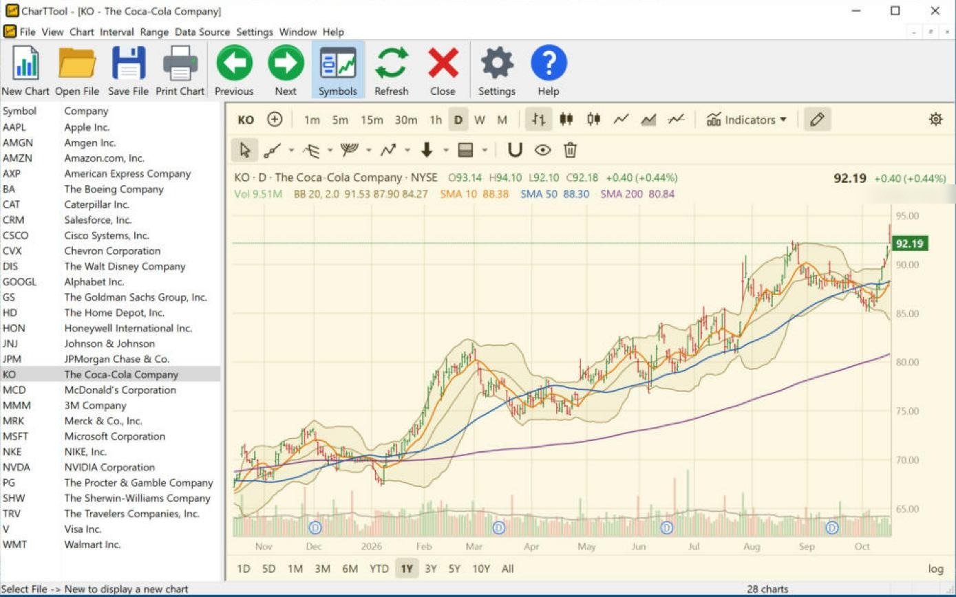
CharTTool chart of Coca-Cola in the Parchment color scheme with open-high-low-close bars and Bollinger Bands
Click to enlarge

Coca-Cola (KO): Parchment scheme, OHLC bars and Bollinger Bands

Parchment scheme · Bars (OHLC) · daily · 1 year · Bollinger Bands, SMA 10/50/200

  • OHLC bars – a vertical line from low to high, with ticks for the open (left) and close (right).
  • Bollinger Bands (20, 2) – the last bar closed at 92.19, above the upper band (91.53), at a new high for the year.

Reading the chart: a steady uptrend with all three averages rising. A close outside the upper band shows strength; it is often followed by a pause back inside the bands rather than an immediate reversal.

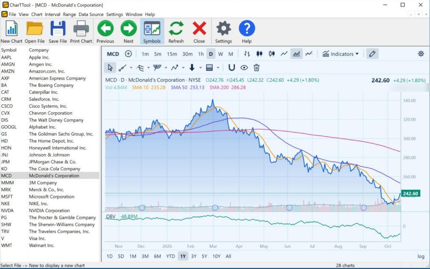
CharTTool area chart of McDonald's in the light blue Sky color scheme with moving averages and an On Balance Volume pane
Click to enlarge

McDonald's (MCD): Sky scheme, Area chart and OBV

Sky scheme · Area · daily · 1 year · SMA 10/50/200, OBV

  • Area chart – the closing prices as a filled line; it hides intraday noise and shows the trend clearly.
  • Moving averages – the 50-day SMA (253.13) crossed below the 200-day (286.28) in the spring (a “death cross”) and both are falling.
  • On Balance Volume – fell to new lows in October, confirming the downtrend; the latest uptick is small.

Reading the chart: a downtrend since the March peak near 340. The +1.80% bounce (242.60) is still below every average.

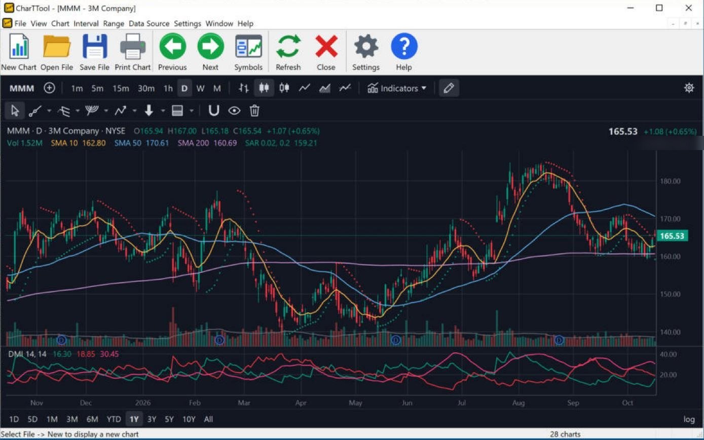
CharTTool chart of 3M in the Dark color scheme with Parabolic SAR dots, moving averages and an ADX/DMI pane, with the Symbols list hidden
Click to enlarge

3M (MMM): Dark scheme, Parabolic SAR and ADX/DMI

Dark scheme · daily candles · 1 year · Symbols list hidden · Parabolic SAR, SMA 10/50/200, ADX / DMI

  • Parabolic SAR (0.02, 0.2) – the dots flipped below price (159.21) on the latest bars: a new buy signal.
  • ADX / DMI (14, 14) – +DI and −DI keep crossing each other since September: no side is in control and the move is a range rather than a trend.

Reading the chart: price (165.53) is between the 200-day (160.69) and 50-day (170.61) averages. In a range the SAR flips often, so its signals are more reliable once ADX rises.

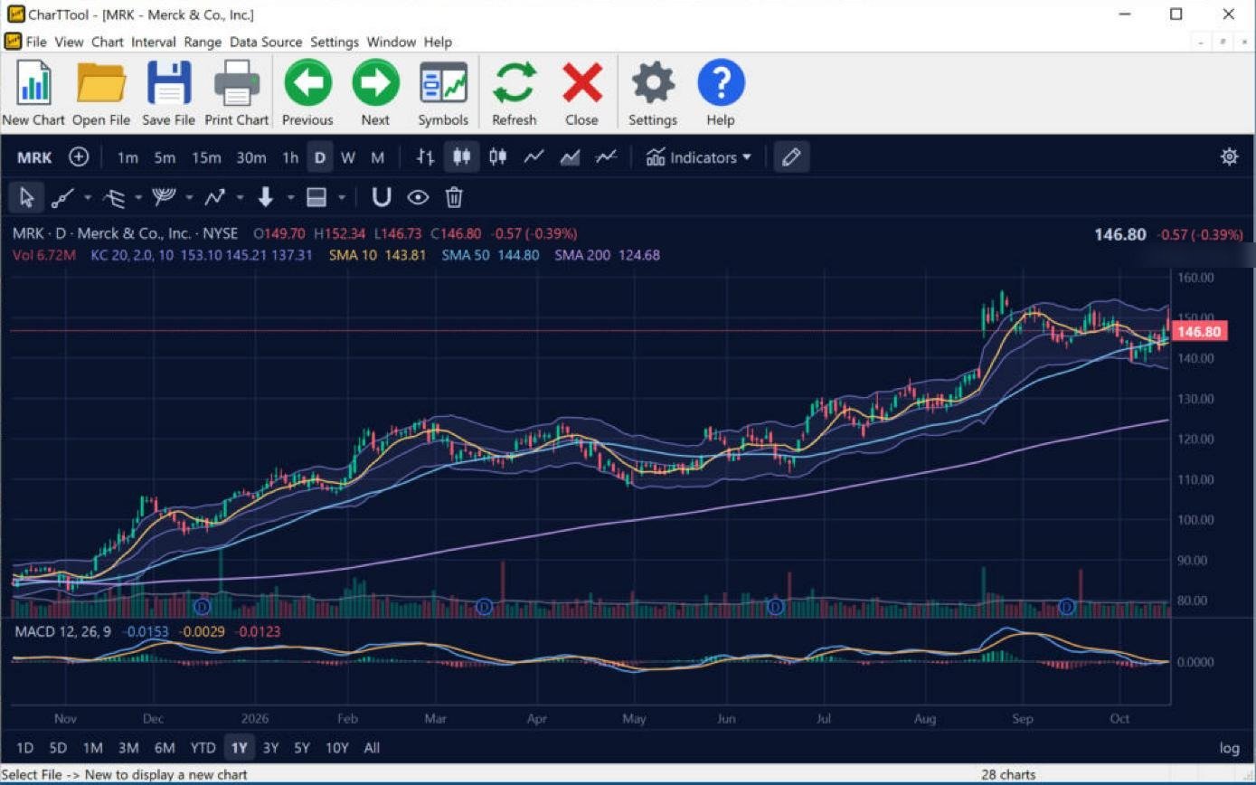
CharTTool chart of Merck in the dark blue Midnight color scheme with Keltner Channels, moving averages and a MACD pane
Click to enlarge

Merck (MRK): Midnight scheme, Keltner Channels and MACD

Midnight scheme · daily candles · 1 year · Symbols list hidden · Keltner Channels, SMA 10/50/200, MACD

  • Keltner Channels (20, 2, ATR 10) – the price has ridden the middle-to-upper half of the channel all year.
  • MACD (12, 26, 9) – flat around zero after the August gap: momentum has paused.

Reading the chart: one of the steadiest uptrends in the gallery – the 200-day SMA climbed from about 85 to 124.68. Price (146.80) is consolidating the August gap above the 50-day average.

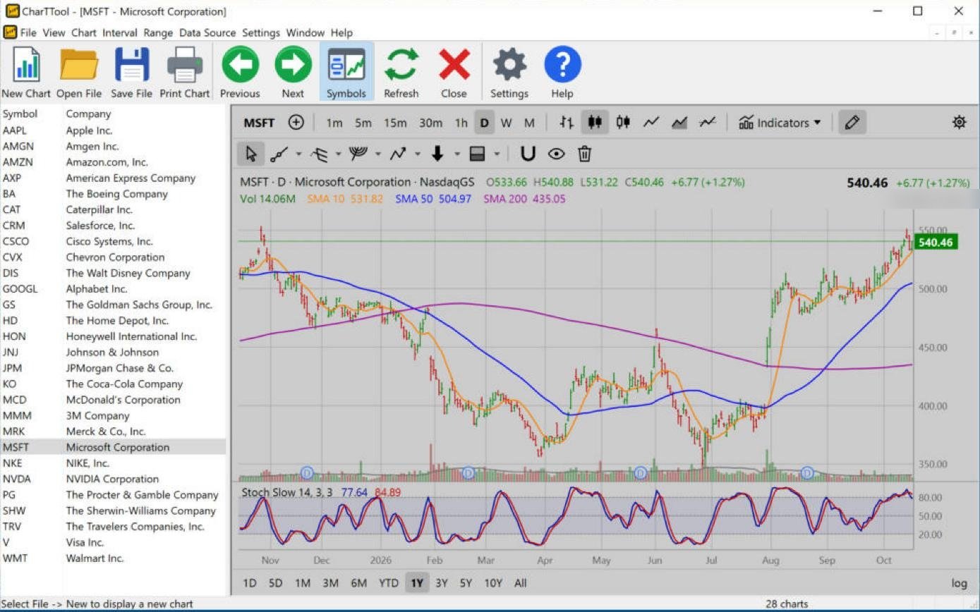
CharTTool chart of Microsoft in the gray Classic color scheme with 10, 50 and 200-day moving averages and a Slow Stochastic pane
Click to enlarge

Microsoft (MSFT): Classic scheme, golden cross and Slow Stochastic

Classic scheme · daily candles · 1 year · SMA 10/50/200, Slow Stochastic

  • Moving averages – the 50-day SMA (504.97) rose back above the 200-day (435.05) after the August gap: a “golden cross”.
  • Slow Stochastic (14, 3, 3) – 77.64 / 84.89, in the overbought zone, with %K just below %D.

Reading the chart: price (540.46) is near the year's high around 550 after a strong recovery. Overbought stochastics in a strong trend tend to mean a pause rather than a top.

Intervals and ranges

Any interval from 1 minute to 1 month can be combined with a range from 1 day to all history.

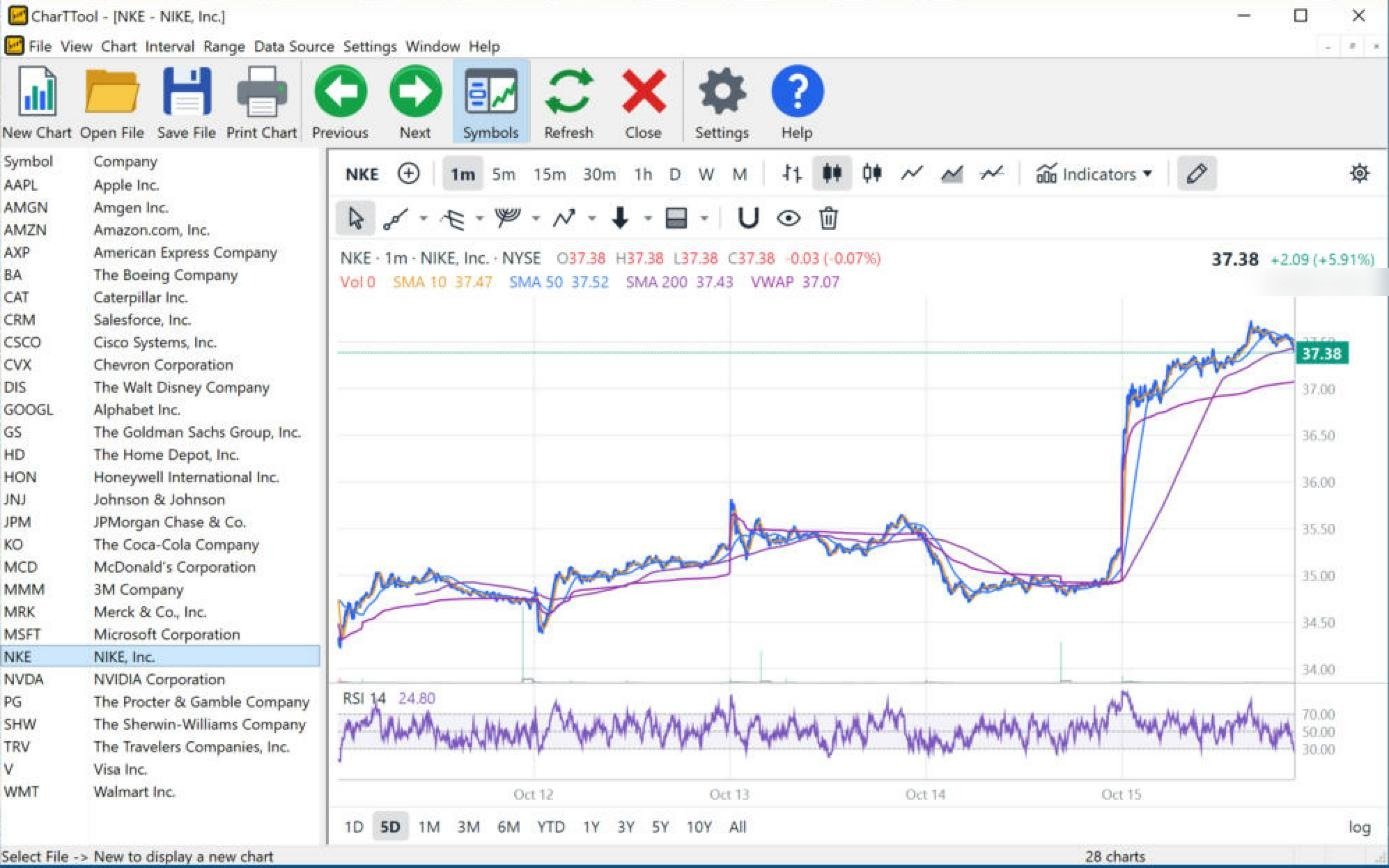
CharTTool 1-minute chart of Nike over five days with VWAP, moving averages and an RSI pane
Click to enlarge

Nike (NKE): 1-minute chart with VWAP

1-minute candles · 5 days · SMA 10/50/200, VWAP, RSI

  • VWAP – restarts at each session open; the intraday benchmark of the “fair” price. Price (37.38) holds above VWAP (37.07) after the October 15 gap up.
  • RSI (14) – on 1-minute bars RSI is very fast; 24.80 shows only a brief dip within the day.

Reading the chart: a +5.91% gap that held all session above VWAP – buyers stayed in control after the opening jump.

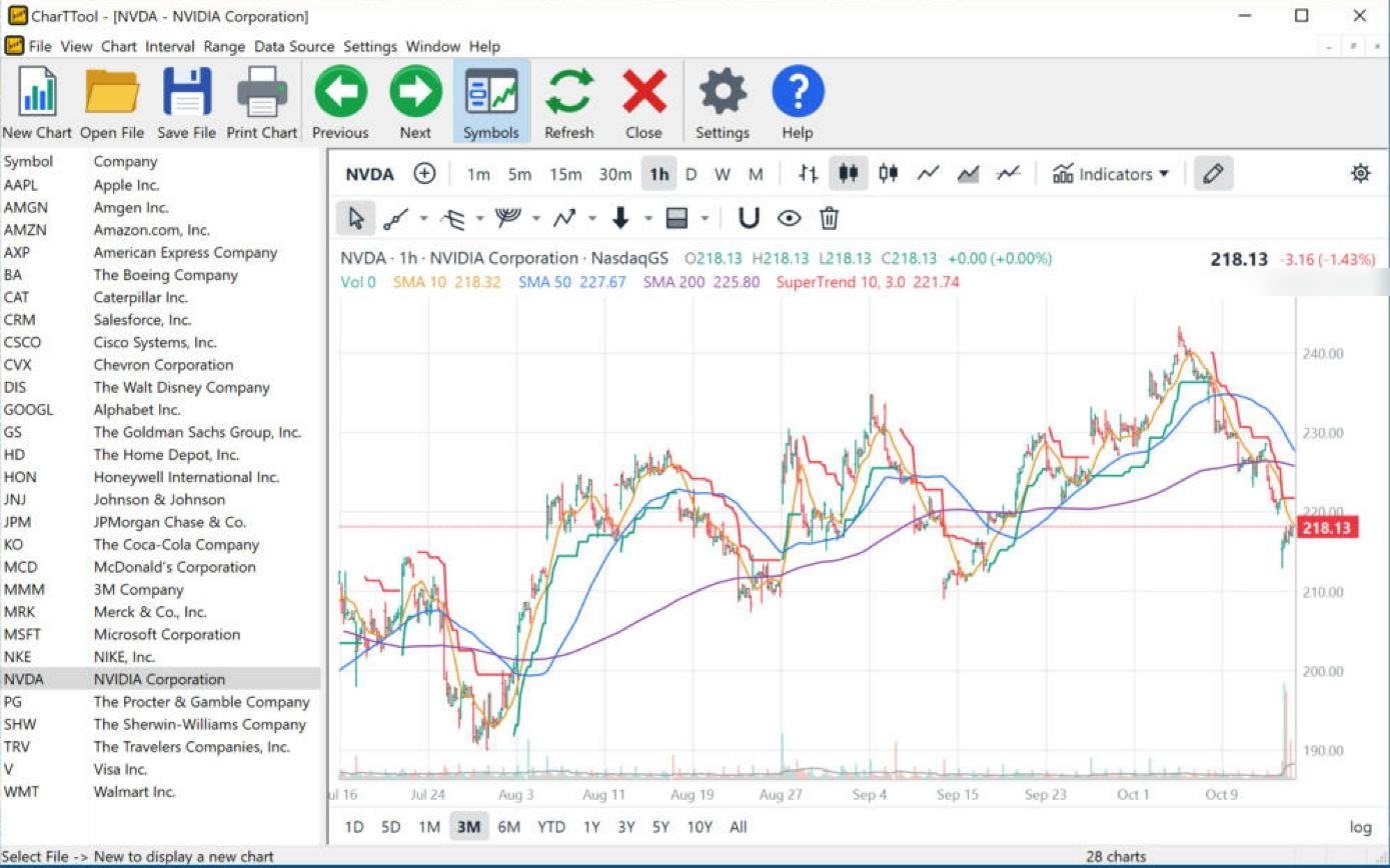
CharTTool 1-hour chart of NVIDIA over three months with the SuperTrend line and 10, 50 and 200-bar moving averages
Click to enlarge

NVIDIA (NVDA): 1-hour chart with SuperTrend

1-hour candles · 3 months · SuperTrend, SMA 10/50/200

  • SuperTrend (10, 3) on hourly bars – flips much sooner than on a daily chart. It turned red after the early-October high near 243 and now sits at 221.74, above price.
  • Moving averages – price (218.13) has fallen below the 200-hour SMA (225.80).

Reading the chart: the short-term trend turned down in October; the September low near 210 is the next support.

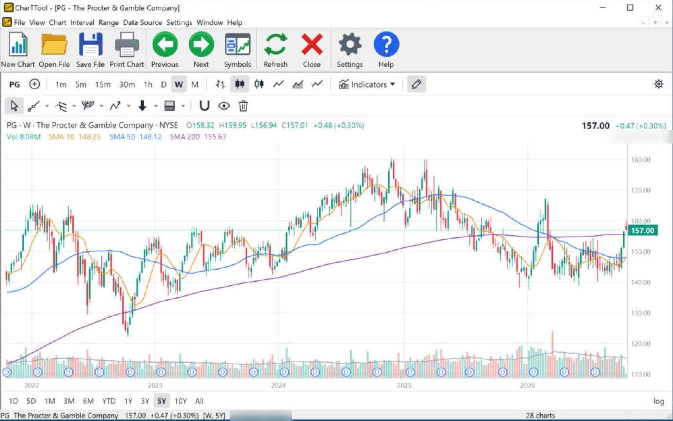
CharTTool weekly chart of Procter and Gamble over five years with 10, 50 and 200-week moving averages and quarterly dividend markers
Click to enlarge

Procter & Gamble (PG): weekly chart, 5 years

Weekly candles · 5 years · Symbols list hidden · SMA 10/50/200

  • 200-week SMA – about four years of closes; it defines the long-term trend and is still rising (155.63).
  • D markers – every quarterly dividend of the five years is marked.

Reading the chart: after a year under the 200-week average, the last weekly candle closed back above it (157.00). A weekly close above the long-term average is a slow but significant signal.

The comments describe how the indicators read on the date of each screenshot (October 2026). They illustrate how the indicators work and are not trading recommendations; see the Disclaimer. Formulas and default settings of every indicator and drawing tool are in the CharTTool User Guide; general explanations are in Technical Analysis.

Download CharTTool free trial Back to CharTTool